Your website's header is an important part of building your brand. But how big should your header be? Web design trends constantly change. Today I'm going to look at 10 popular websites in different markets and look at their header size and layout as well as their logo size.
Purpose Of Website Header
Your website's header is very important as it's the first thing most people see when they visit any page on your site.
It identifies your brand and associates the page content with it. It stands out more than a little by-line under an article title.
Headers are also used to provide a consistent area for navigation, a way to feature content as well as a prominent place for ad placement.
Smaller Headers are Better
When the web first started, companies wanted to make sure you knew what site you visited. Logos were very prominent and headers were quite big.
The homepage of a site was mostly all branding in many cases displaying nothing but a logo with a (click here to continue) link. Splash pages no longer seem to be popular.
Things have changed now and quality content is more important than shoving a logo in your face. People have started to wake up to the importance of a good user experience. Both headers and logos have gotten much smaller. Branding is spread throughout the web design.
Even Google recognized this and made a change to their algorithm to penalize sites that don't put their content above the fold.
Product Sites
Product sites are important to help build brand awareness and provide information for current and future customers. Product sites used to be the worst when it came to throwing their brand in your face. My how times have changed.
Pepsi
Header Height: 45px
Logo Size: 134x33px
Logo Size: 134x33px
When you visit pepsi.com the word "Pepsi" only appears twice and is not even in the logo. Their brand is in multiple places throughout the page. Now the header shows their log (off to the side), navigation and social sharing buttons. Pepsi Pulse highlights the content of the site and even includes their customers by posting some of their tweets. Customer participation is key!
Coca-Cola
Header Height: 50px
Logo Size: 120x42px
Logo Size: 120x42px
The logo has gotten much smaller but there's no doubt about where you are when you visit cocacola.com. No more full-page splash page of a spinning glass Coke bottle or whatever they had before. Very simple navigation too.
Western Digital
Header Height: 95px
Logo Size: 120x36px
Logo Size: 120x36px
The majority of the header on wdc.com consists of navigation to help you (the customer) find information about the company and it's products. Featured products take prominence on the page.
Shopping Sites
When it comes to shopping sites, the most important goal is to sell products. Secondary is identifying the brand to instill trust. The headers of two popular internet shopping sites below do just that.
The Home Depot
Header Height: 158px
Logo size: 60x60px
In this case I'm calling the header of homedepot.com the region from the top of the page to the bottom of the search form. They provide important information that will help sell products. Highlighted are promotions to entice you to buy online, followed by some other services that would be beneficial to customers (store finder, installation, tool rental, gift cards, and instructional pages) and the all important search bar which helps customers find their products.
Amazon
Header Size: 100px
Logo Size: 120x46 px
The mother of all retailers knows what's important. The header on amazon.com consists only of information that promotes products or helps you buy the products you want.
Content Sites
With content sites it's all about the content, duh! and these popular blogs and article sites know it. Content sites also make money through advertising and since the header is a prominent location, it usually has an ad.
This Old House
Header Height: 214px
Logo Size: 208x132px
From the organization that is responsible for more bruised thumbs and foul language than anyone else, thisoldhouse.com knows what's important. Header size is on the high side but it emphasizes helping readers find the information they're looking for. It's also dominated by a leaderboard ad which helps keep the enterprise running.
lifehacker
Header Height: 86px
Logo Size: 300x82px
This popular blog on useful tips and tricks knows what it's visitors want when they type lifehacker.com in their url bar. There's really almost no header to speak of and the Logo is half overlaid near the featured content.
Laughing Squid
Header Height: 72px
Logo Size: 200x200px
The beloved San Fransisco blog laughingsquid.com which helped popularize @ShitMyDadSays doesn't need a huge header. The header is only 72px tall and consists solely of navigation. They went with a large logo but moved it out of the header and into the right sidebar.
gothamist
Header Height: 264px
Logo Size: 162x168px
The header on gothamist.com is on the larger side but it's more about featuring content and one ad than it is about branding. The logo takes up relatively little space. No navigation other than the search form on the left.
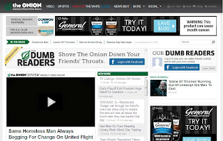
the Onion
Header Height: 200px
Logo Size: 172x48px
True to form theonion.com header isn't what it appears. The header is broken up into 3 sections. A branding header with the logo and main navigation at 60px high, a 90px subheader dominated by a leader board ad, finally a 28px high navigation bar with search along with padding in between. These all provide a very clean look to this otherwise large header.


3 comments:
Thanks, this comparison helped me choose appropriate header sizes and header image sizes for my website.
Thanks
How about your personal website in wordpress whats the perfect size in header?
Thanks